Techniques for responsive typography

Techniques for responsive typography

Uncategorized
Introduction to Responsive Typography Responsive typography is a crucial aspect of modern web design. It enhances the readability and aesthetics of text across a variety of devices by adapting typefaces, sizes, and layouts to ensure optimal viewing experiences. With the rapid proliferation of smartphones, tablets, desktops, and other internet-enabled devices, having typography that adjusts seamlessly to different screen sizes is increasingly important. This adaptability is necessary to provide users with an optimal reading experience on any device they choose. The Importance of Responsive Typography Effective responsive typography can significantly enhance the user experience. In today's digital age, content is accessed from a wide array of environments and devices, and ensuring that typography remains both legible and visually appealing is paramount. This aspect of web design plays a critical role in…
Read More
Building a responsive image gallery

Building a responsive image gallery

Uncategorized
Introduction In today's digital landscape, designing websites that provide a seamless user experience across various devices is no longer optional; it’s mandatory. Part of this experience includes the effective presentation of images through a responsive image gallery. Such a gallery not only enhances the aesthetic appeal of a website but also contributes significantly to its functionality by ensuring that images appear clearly, regardless of the device in use. This article dives into the core techniques and principles required to create responsive image galleries, exploring various CSS methods that simplify the process. Understanding Responsive Design Responsive design is an approach to web development that ensures web pages render well on a variety of devices and window or screen sizes. With the increasing use of mobile devices, planning for responsive design is…
Read More
Introduction to media queries in CSS

Introduction to media queries in CSS

Uncategorized
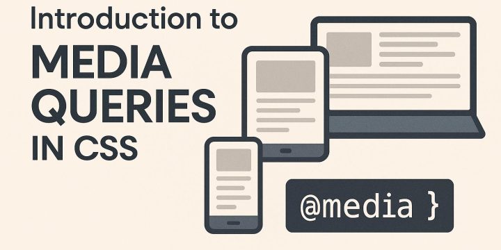
Understanding Media Queries in CSS Media queries play a fundamental role in responsive web design, offering developers the ability to tailor styles based on the characteristics of the device accessing the website. This adaptability is essential as it enhances user experience by ensuring that web pages look good on all devices, from desktops to smartphones. What Are Media Queries? Media queries are a CSS3 feature that allows content rendering to adapt to different conditions like screen resolution, viewport size, orientation, and more. By using media queries, developers can specify different styles for different devices or screen sizes, enabling a single webpage to present differently across various devices. Basic Syntax The basic syntax of a media query includes the @media rule followed by one or more conditions specifying when to apply…
Read More
How to optimize CSS for performance

How to optimize CSS for performance

Uncategorized
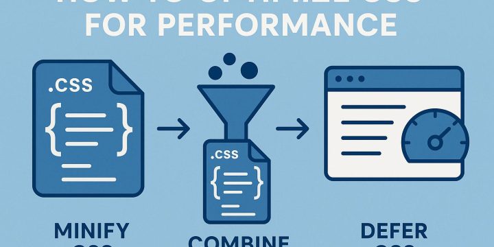
Understanding the Importance of CSS Optimization Optimizing CSS is essential for enhancing website performance. Efficient CSS reduces the load time of web pages, resulting in better user experience and improved search engine rankings. By minimizing the size and complexity of CSS files, you can ensure quicker rendering times and smoother interactions. Minimizing the Size of CSS Files One of the primary methods for optimizing CSS is by reducing the file size. This can be achieved by removing unnecessary whitespace, comments, and redundant code. Tools like CSS Minifier and UglifyCSS automate this process, stripping out superfluous elements without altering the file's functionality. Additionally, employing a modular approach to CSS—by separating styles into components—can aid in reducing bloat. By focusing on the size and structure of your CSS, you can make a…
Read More
Tips for improving website load speed

Tips for improving website load speed

Uncategorized
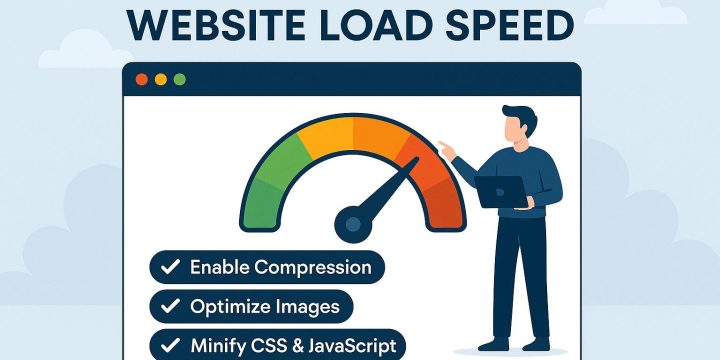
Understanding the Importance of Website Load Speed A fast-loading website is crucial for maintaining a positive user experience and improving search engine rankings. Slow websites can lead to high bounce rates and decreased conversions. Therefore, it is essential to focus on optimizing load speed to ensure both user satisfaction and search engine success. Optimize Image Sizes Images often contribute significantly to the overall size of a webpage. It is important to ensure that images are appropriately sized and compressed to reduce loading times. Use tools like TinyPNG or Compress JPEG to optimize images without compromising quality. Additionally, consider using modern image formats such as WebP for more efficient compression. Proper image optimization is a fundamental step in reducing unnecessary weight on your web pages. Large images can slow down site…
Read More
The role of whitespace in web layouts

The role of whitespace in web layouts

Uncategorized
The Importance of Whitespace in Web Layouts Whitespace, also known as negative space, is a fundamental element in the realm of web design. It refers to the areas of a page that remain unmarked, encompassing spaces between graphics, text, and elements such as margins and gutters. While this aspect of design may be overlooked by some, it is crucial in improving user experience and ensuring the clarity of a design. Understanding Whitespace in Design Whitespace is more than just empty space; it is an active component of design strategy. It helps shape the page layout and influences how the content is perceived by users. Whitespace should be considered carefully because it dictates the flow of the page and affects the overall aesthetics. Designers must strike a balance between content and…
Read More
Designing engaging website footers

Designing engaging website footers

Uncategorized
Understanding the Importance of Website Footers The footer of a website might not always attract much attention during the initial design phase, yet it stands as a pivotal aspect of the overall website structure. Acting as a supportive yet significant element, the footer conveys additional navigation options, vital information, and often plays a decisive role in reinforcing a site's branding efforts. By strategically designing an efficient footer, web designers can significantly enhance the user experience, transforming the footer into a comprehensive guide for visitors. Elements of an Effective Website Footer In crafting a useful website footer, it's important to recognize certain elements that typically characterize well-designed footers. Although a universal template doesn't exist, effective footers often embody features like contact information, social media links, and additional navigation links that support…
Read More
Building an effective website header

Building an effective website header

Uncategorized
Understanding the Importance of a Website Header In the digital age, the website header is akin to the storefront of a physical shop. It represents the initial point of contact between the user and your site's content. A well-crafted header is a vital component that not only shapes the first impression but also dictates the usability and overall user experience. This section delves into its significant role and offers insights into constructing an effective header that reinforces the site's performance and user engagement. Key Elements of a Website Header To ensure that a website header serves its purpose efficiently, it must incorporate integral elements that enhance usability and branding. The following are some key components: 1. Logo and Branding: Prominently featuring your logo in the header is essential for brand…
Read More
How to design a modern landing page

How to design a modern landing page

Uncategorized
Understanding the Purpose of a Landing Page In the realm of digital marketing, a landing page plays a critical role by serving as a targeted web page created specifically for a marketing or advertising campaign. The primary objective of this page is to convert visitors into leads or customers. Unlike a homepage, which typically presents a comprehensive overview of a website's offerings, a landing page concentrates on a singular goal. This often involves a call-to-action (CTA), encouraging users to undertake a specific action such as signing up for a newsletter or purchasing a product. By streamlining the focus, landing pages are designed to minimize distractions and enhance the likelihood of conversion. Key Elements of a Modern Landing Page Creating an effective landing page necessitates the integration of several pivotal components.…
Read More
Creating a custom color palette with CSS

Creating a custom color palette with CSS

Uncategorized
Introduction to Custom Color Palettes in CSS When designing a website, selecting an appropriate color palette is crucial for creating an engaging user experience. CSS offers several methods for defining custom color palettes, enabling developers to maintain consistency and flexibility throughout the design process. Defining a custom color palette not only enhances visual appeal but also eases maintenance and updates. CSS Variables for Color Management CSS variables, or custom properties, provide an efficient way to manage colors across a stylesheet. By defining colors as variables, you can easily update them, ensuring uniform changes across all instances where they are applied. A CSS variable is declared by using the -- prefix. ```css :root { --primary-color: #3498db; --secondary-color: #2ecc71; --accent-color: #e74c3c; } ``` In the example above, three colors are defined as…
Read More