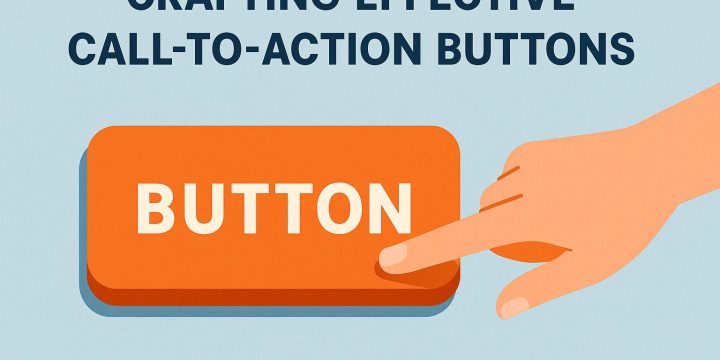
Crafting effective call-to-action buttons
Understanding the Importance of Call-to-Action Buttons Call-to-action (CTA) buttons are pivotal elements on web pages, influencing user engagement and conversion rates. Positioned strategically, they guide users toward a desired action, such as purchasing a product, signing up for a newsletter, or downloading an app. Crafting effective CTA buttons requires careful consideration of their design, placement, and text to maximize their effectiveness. Design Attributes of Effective CTA Buttons A well-designed CTA button is crucial for guiding users towards the actions you want them to take. Let's explore some design attributes that can make these buttons more effective. Visual Appeal: The design of a CTA button should ensure it stands out, while still aligning with the website's overall design theme. Using contrasting colors is an effective way to draw attention to the…